Date: Sept. 2022- Dec. 2022
Tools: Figma, Maze.co, Miro, Dropbox, Google Meet, Zoom, Slack, Around
Role: UI/UX Designer
Team: Worked in partnership with designers, developpers and communications coordinators
Currently, the Employer Services (ES) division includes three areas that support the employer customer experience: intake/payments, education, and compliance. The three areas do not have shared view of the employer, hence they must individually collect and store information. This could potentially lead to having unknown conflicting conversations, preventing a holistic view of the employer.
Project Goals
Lab Goal
Help the ES team go through the Discovery phase of a project, so that they have a clear understanding of where they would like to focus their efforts moving forward.
Stakeholder Goal
Explore how to create a Holistic 360 View of their customers that each team with the Employer Services space can leverage and be equally informed about each customer.
Research
Job Shadowing with Stakeholders (User Interviews)
Six job shadowing sessions were conducted with employees from the three divisions i.e., Employer Services (ES), Wilkens Health & Safety Solutions (WHSS), and Compliance. During the job shadowing sessions, participants were asked to demonstrate and explain their roles, tools that they use, common tasks (user flows) that they perform. The main purpose and goal of the sessions were to: (i) better understand how teams interact with each other and employers, (ii) identify pain points and areas of improvement.
Thematic Analysis of Findings
Following the job shadowing sessions, the designers performed a thematic analysis on the notes to identify any overlapping themes and/or pain points. No glaring pain points affecting each team's workflow were identified. However, areas of improvement in efficiency and service for employers were recognized and outlined in a slide deck.
Data Grouping Workshop
For the first two rounds of iterations, we focused on creating a dashboard with assisting features such as: notification bell, note analysis, pinned files. However, after further discussion and reflection on our progress with the Stakeholders, a new direction has been set to help accomplish what they “truly want”.
In the latest iteration, we focused on displaying pieces of data from a merged data set. Hence, with 90+ data fields, it would be optimal to group and section similar data for quicker navigation. A ‘Data Grouping Workshop’ was held to determine the most appropriate groupings and rankings of data/sections.
A/B Testing
After completing multiple iterations and shifting direction, A/B testing was conducted within the Lab to gain feedback from other perspectives, and find a consolidated view on the screen's architecture. To optimize the quality of feedback from participants, testing materials were separated into three different categories:
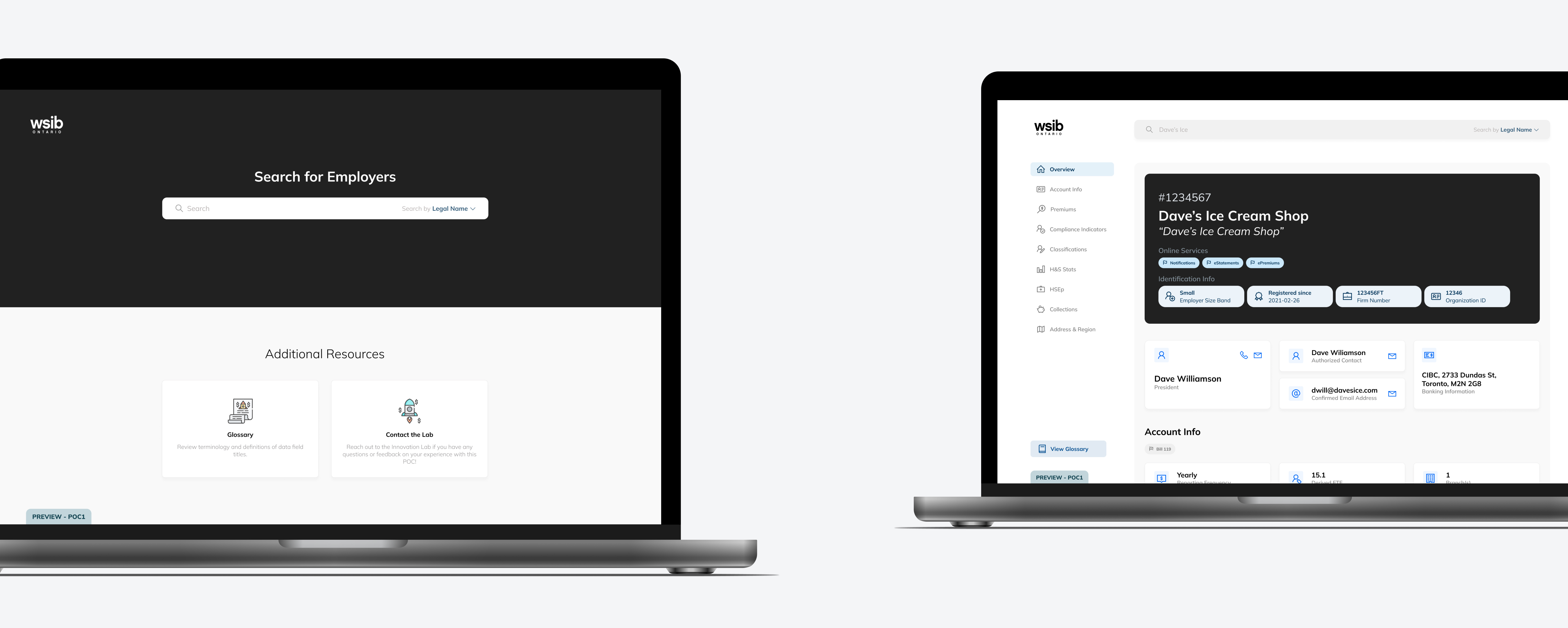
Final Prototype
*Note* Ideally, users will be able to leverage the ‘auto-scroll’ shortcuts and the manual scroll.
Additional prototypes of the dashboard and glossary are also included below to demonstrate how a user can leverage the tabs/shortcuts.
Design Iterations
Ideation + Lo-fis
Following the thematic analysis, we began to individually visualize the features and their hierarchy on the dashboard. Only the features which the stakeholders label as "prioritzed features" were included in the dashboard.
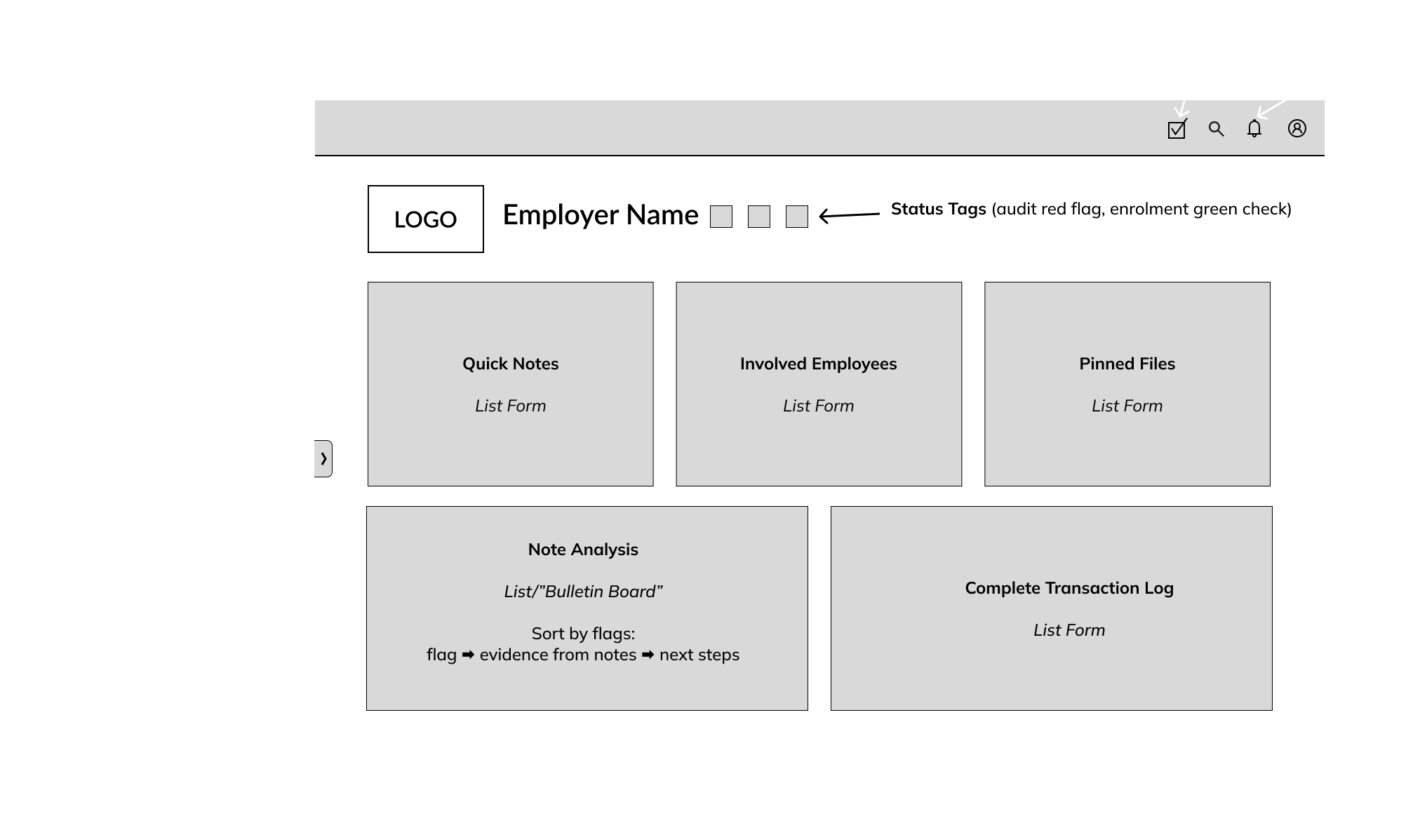
Mid-fis
mid-fi v1
The first iteration of the dashboard is a rough visualization that combines our sketches and the finalized architecture.
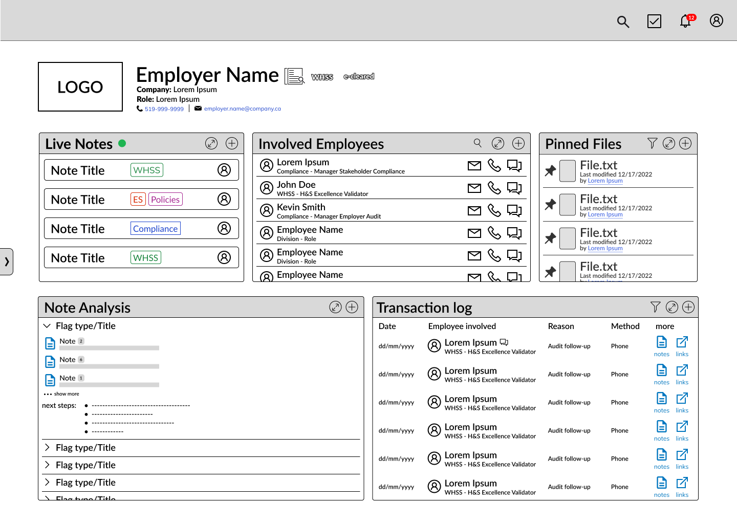
mid-fi v2
After receiving feedback, we expanded the widgets and added tabs to organize the features for a cleaner appearance.
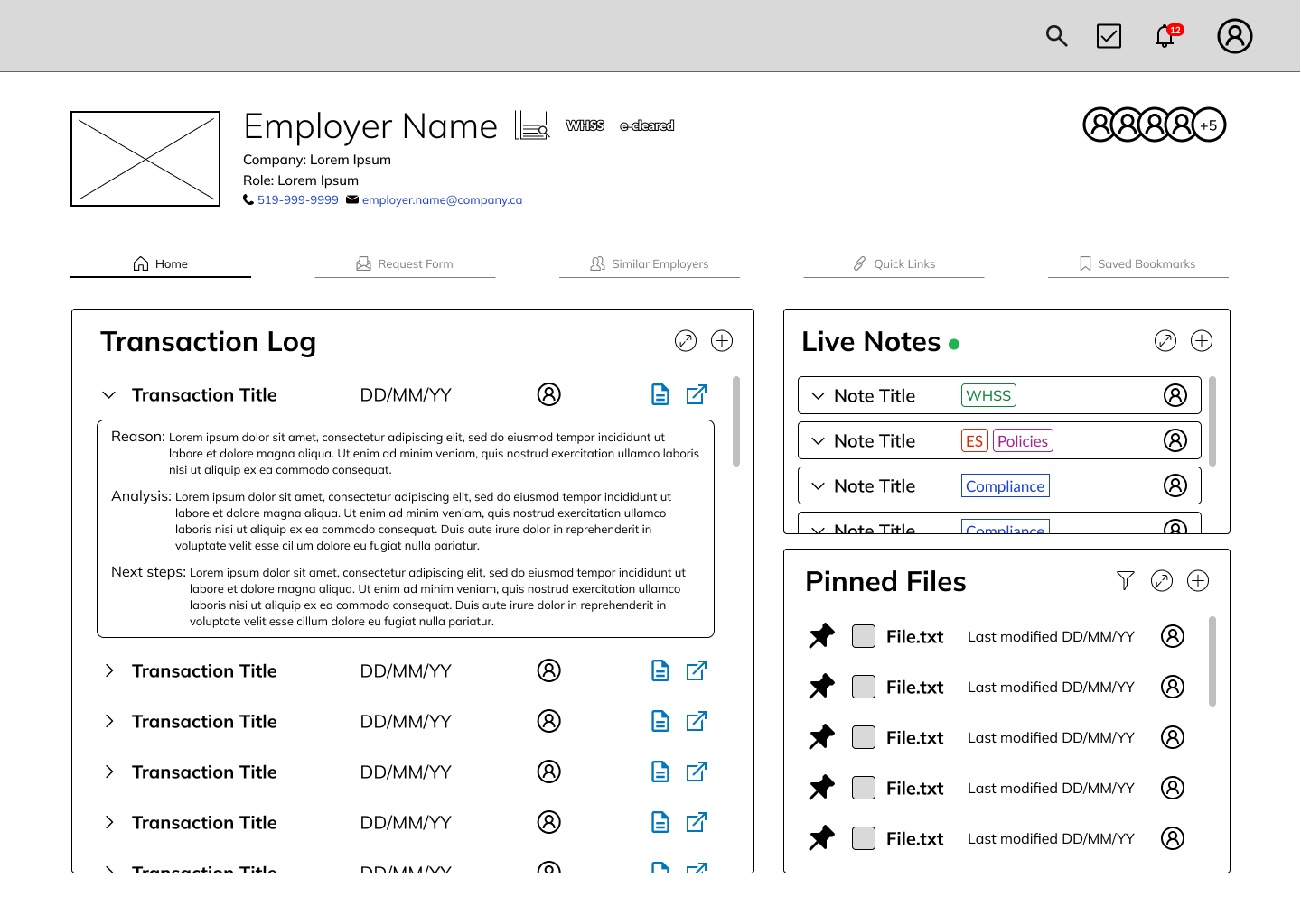
Hi-fis
hi-fi v1
Leveraging the Lab’s design system for consistency, typography and other visual elements were added and refined to enhance the overall appearance of the dashboard.
hi-fi v2
Following meetings with the stakeholders, our direction gradually adjusted to disregard the “proposed features” and focus solely centralizing and visualizing the 90+ fields of data.