Date: Feb. 2022- Apr. 2022
Tools: Figma
Role: UX Visual Designer
Team: Worked in partnership with Lead Designers
Overview
I worked directly with two Lead designers on the project, and my role was to create visual direction for a new feature that would provide Help information that is contextual to the content of the current page.
One of our main goals was to ensure the feature would not be confused with the primary product that it was related to. As such, I was not required to strictly follow existing standards. However, I still needed to provide a design that could sit alongside the existing product design language with a strong level of cohesiveness.
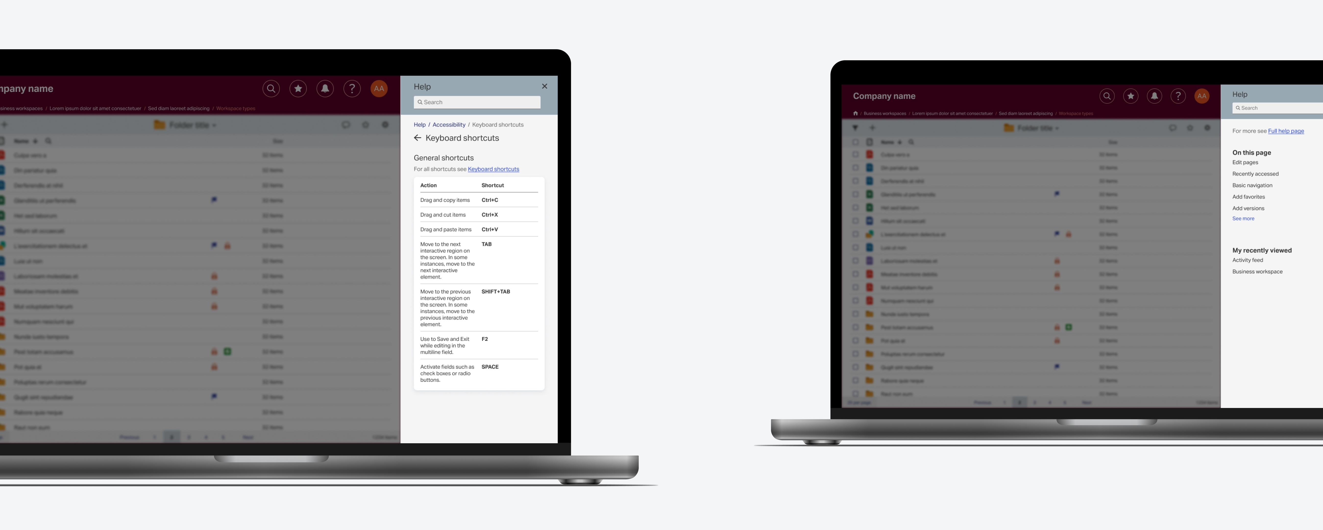
We initially identified a few key screens that contained a variety of information types from standard content paragraphs to tables and callout information. I explored numerous rounds of iteration exploring colour, depth and content containers.
As we narrowed down the styling I also created interactive prototypes that showed the Help panel working and the navigation between various levels.
What would I want to address or work on if I had more time
If I had more time, I would continue to work on the responsiveness of the design. I can do so by creating mockups and prototypes of different screen types and sizes, and compare the wireframes and animations to verify for consistency. This process may also help identify any components and/or elements with limited responsiveness (e.g. tables).
Early Iterations
After interacting with a provided a prototype and reading over the results of a usability test, I began creating iterations that incorporated the feedback received from the participants. I wanted to work on the "main layout" of the panel before exploring further elements, hence I started with the overview page and simple information screens (e.g. short paragraphs).
A common observation that participants made was the simplicity and lack of visual elements in the original design. Thus, I decided to explore with colours and "cards" as content containers. In the end, after a multiple rounds of iterations, we decided to use a light grey background and white content containers with a blurred drop shadow. With the blurred drop shadow, we felt the white cards had the best level of brightness to make the cards stand out without using harsh colours that did not sit well with the main product.
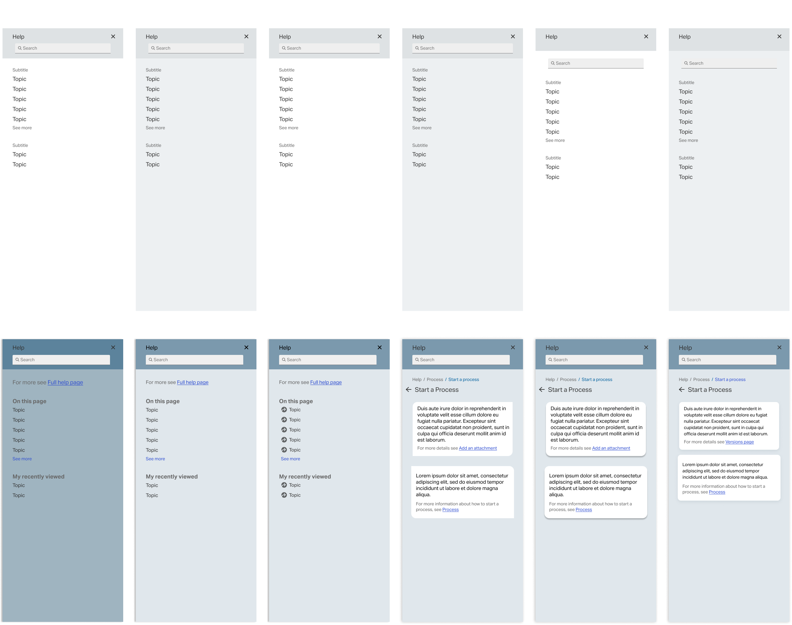
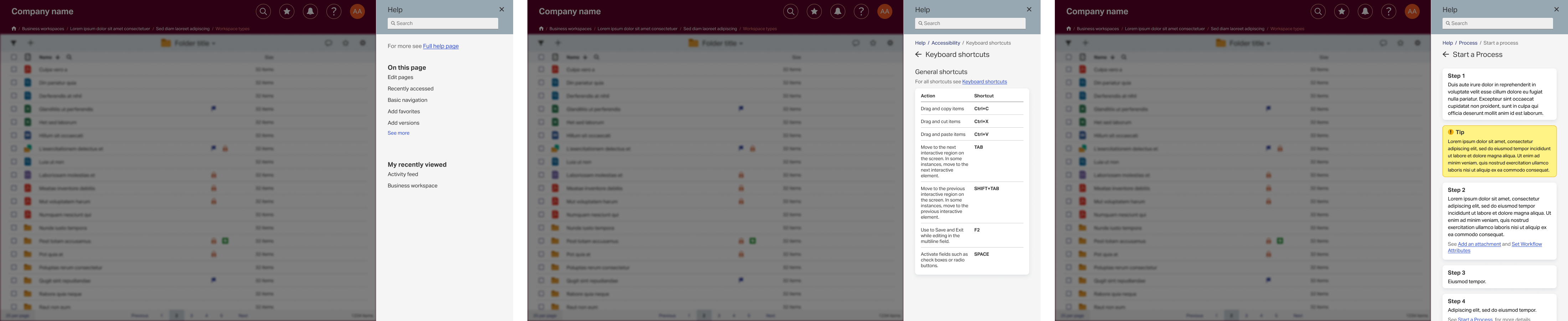
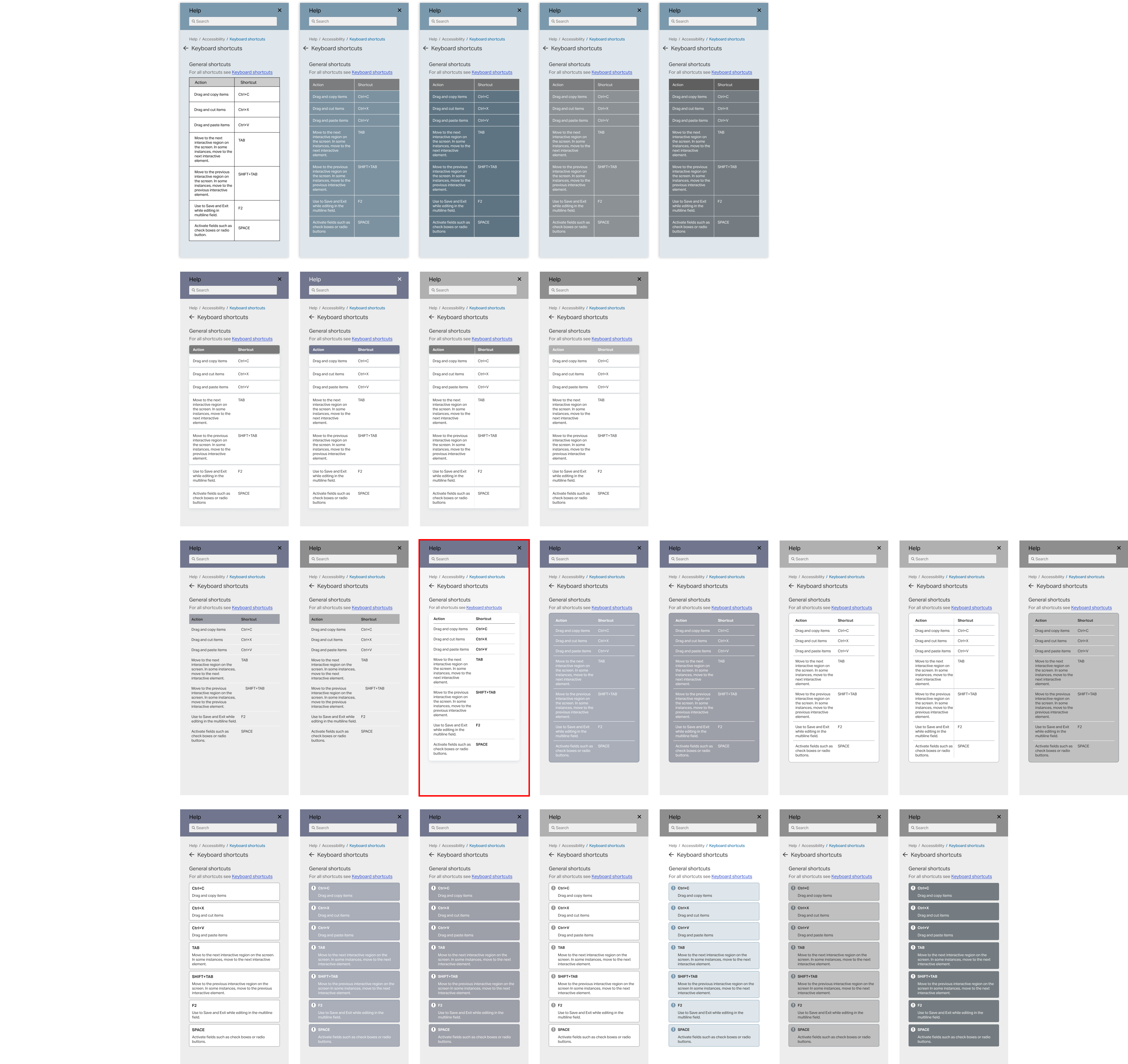
Table Iterations
After going over my set of iterations with the Lead Designers, I started exploring with other types of content containers: tables. Once again, I started with adding colour to the standard tables and later began reforming the table's layout, as shown below, for a more modern look. We decided to go through with the lightweight table outlined in red due to its ability to clearly communicate information while still maintaining the image of a table and conforming to the description cards' design.
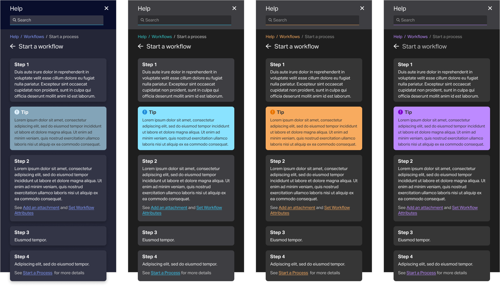
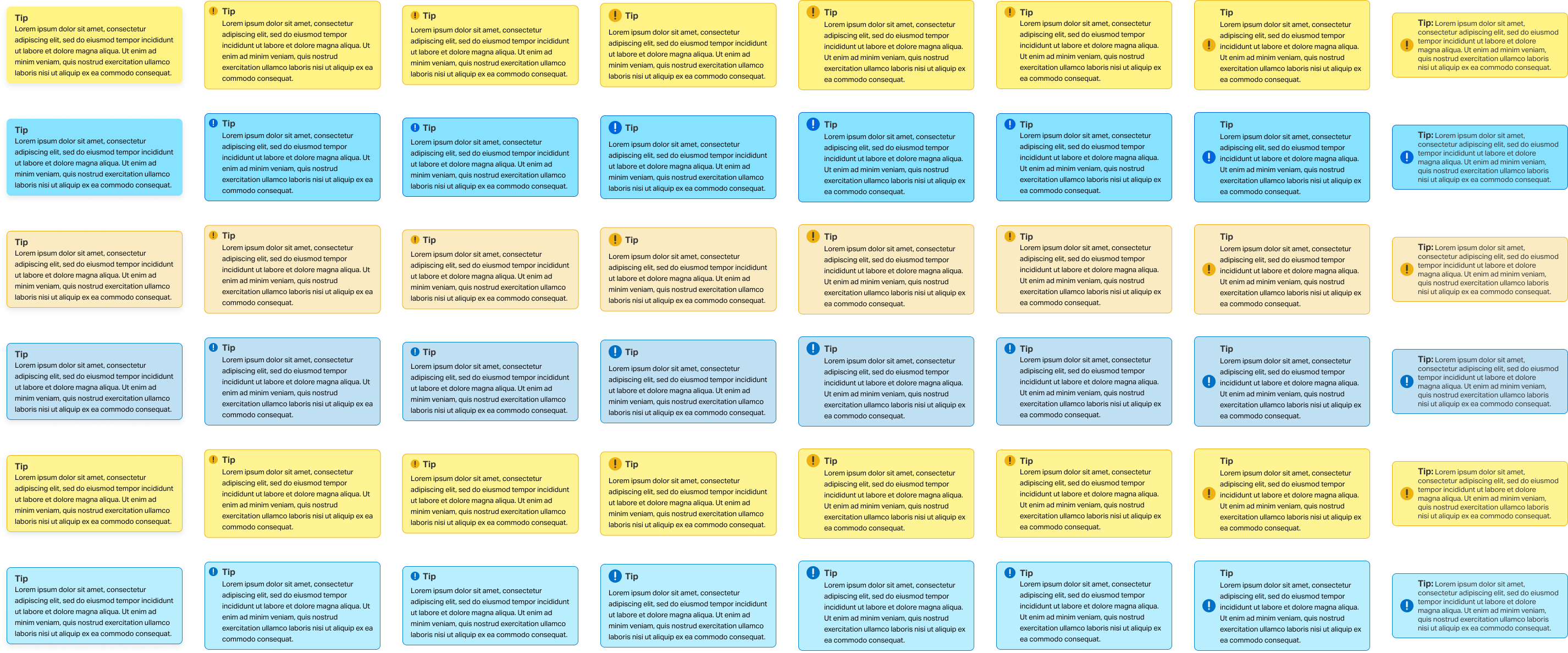
Tip Card Iterations
For the tip cards, we thought of creating cards that are similar to Post-it notes, hence the bright yellow and blue colours. Most of my exploration concerned the size and placement of the tip icon as well as different shades and levels of opacity of yellow and blue.
Dark Mode Exploration
After finalizing the design for the standard panels, we were asked about the possibility of creating a set of 'dark mode versions'. Many users prefer dark mode, thus having congruent panels would help improve their user experience.